Imagine, however outlandish the scenario might be for you, that you’re a high school girl. Like any other teenager, your hormonal imbalance and boundless curiosity is driving you to explore some intimate activities with another person. Nothing wrong with a little experimentation, right?
Increasing Flipp’s User Engagement
Disclaimer: I don’t work for Flipp. This case study is a personal exercise to explore how a “create budget” feature within Flipp could work. If you have any comments please don’t send Flipp your feedback. They’ll have no clue as to what you’re talking about. Instead, comment below. I’d love to hear your thoughts!
YOU ARE AN EXPERT IN SOMETHING: CREATE A PROFITABLE ONLINE COURSE WITH WORDPRESS
As we all know, WordPress was initially conceived as a blogging platform, allowing users to easily share thoughts and ideas on the web. Although it has evolved into a very extendable CMS with vast capabilities which developers now use to create some of the most highly visited sites in the world, many WordPress users are still utilizing the platform to deliver valuable, actionable content.
AREXA FONT
Arexa is a hexagonal heading font with 160 glyphs. Crafted with perfection, passion and love. It is inspired from honey comb.
Honey comb is the strong structure with high storage area to store more amount of honey. Its symmetric ability makes the typeface clean and crisp.
Facebook’s head of design on creating for 2 billion people
Luke Woods is the Head of Design at Facebook. In this episode, we discuss how digital design is in a unique position to make an impact on the world, dive into the details of what the evolution of design looked like at Facebook, and learn the importance of three little words: understand, identify, execute.
Motion Design Specs – How to Present Animations and Interactions to Developers
Nowadays, a static app UI design is not enough. The Motion Design is no longer future of the UX Design. It is an essential element of digital product creation. If you are designing animations and interactions you should know how to prepare Motion Design Specification for Front-end Developers.
Where Do We Go from Mobile First?
Have you heard “mobile first” recently? It was a buzzword, back… six or seven years ago. And now it’s coming around again, almost like we’ve been through a full wash and rinse cycle with design theories – mobile first to responsive web design, and now back to mobile first. But that can’t be right.
The Grid System: Building a Solid Design Layout
Now that we’ve seen some grids at work in the Rule of Thirds article, let’s examine them a little more deeply. As a concept that deals so fundamentally with the fabric and background of our work as designers, it’s easy to overlook the power of grids and think more about the elements we want to create. Many traditional artists still paint their masterpieces over a feint series of intersecting lines. To help us make the most of our work surfaces and create with precision, we designers have a tool that echoes this. We call it the Grid System.
Lessons to learn from LinkedIn Redesign
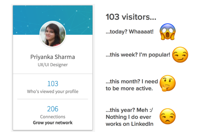
This is not a redesign post. I think there have been enough redesigns of popular social platforms and I believe I can’t offer any breakthrough UX changes without having the full context of how a system works. Instead, I am pointing at the areas where their own take at redesign did not do well and suggesting lessons we can learn from those mistakes.
Resources to Start Learning Design
A lot of my YouTube subscribers have asked me how to start learning design — what online courses to take, books to read and blogs to follow. So, I compiled a simple list to help you get a start on UI, UX, Interaction, Graphic and Visual Design.


