5 Principles of Successful Design Leaders

Arthur Gensler shared 50 years of hard learned lessons in building a world class professional service firm in one brightly colored book.

First off, Mr. Gensler is pretty amazing. As I’ve delved into the world of interior design and space design, I’ve found that the firm behind the office designs of some of the most innovative and fast moving companies in the world, is under the realm of this man. He is a Fellow of both the American Institute of Architects and the International Interior Design Association, and a professional member of the Royal Institute of British Architects. He graduated from Cornell University’s College of Architecture, Art and Planning and is a member of its Advisory Council. Art is also a charter member of Interior Design magazine’s Hall of Fame and a recipient of IIDA’s Star Award, and received Ernst & Young LLP’s Lifetime Achievement Award and the Cornell Entrepreneur of the Year Award.

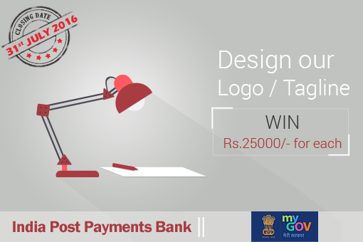
Logo Design and Tagline Competition for India Post Payments Bank

With over 1.54L branches across the country, India Post enjoys the love and trust of millions of Indians. The objective of India Post Payments Bank (IPPB) is to provide affordable and useful banking services to people who don’t just have limited access to banks, but might never have banked before. This is true financial inclusion. With a network spanning across every corner of the country, the postal service will now deliver prosperity to rural India as well as semi urban towns.

We invite you to design the visual identity of India Post Payments Bank (IPPB).

THE IDEA DESIGN WORKFLOW

As designers, we are constantly experimenting with tools and processes in an attempt to find the one that works best. After a great deal of experimentation, I’ve discovered the perfect design workflow, and I’m going to share it with you now. Design is a process and the process I’m going to share is the one I’ve used on all my projects to build habit-forming products that people love.

Hamburgerless. On creative mobile navigation.

An Update on the Hamburger Menu ‣ Basement Menus and Breaking the “Rules” of App Design ‣ Hamburgers & Basements: Why Not to Use Left Nav Flyouts ‣ Hamburger icon: How these three lines mystify most people ‣ Mobile App UX Principles: Improving User Experience and Optimising Conversion ‣ Mobile Navigation ‣

Designing for iOS 10

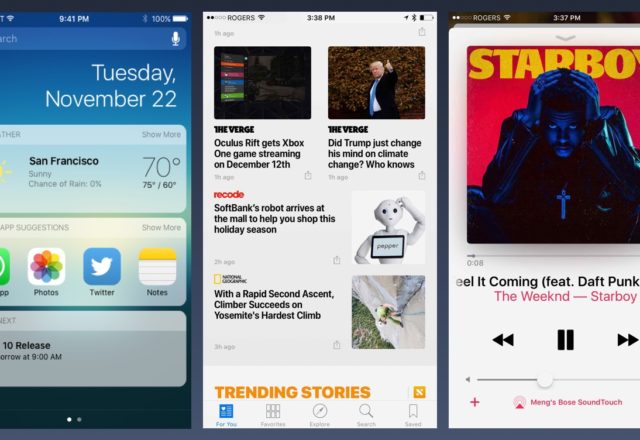
While Apple calls iOS 10 their biggest release ever, most of the new features are consumer-facing, like Widgets, Siri/Messages integration, and expanded notifications.

For designers, the only noticeable design changes are bolder titles and bigger use of cards, as seen in native apps like Music and News. Whereas iOS 7 started with a widespread use of thin fonts, iOS 10 is going back to using bolder texts.

The Visual Language of Designing for Touch

In the print world, paper choice is critical to understanding what kinds of design can be supported. For example, try putting an embossed foil stamp on vellum. On desktops, designers know they have a pristine canvas (the monitor) to work on. Such a canvas is also guaranteed to be used in well-lit conditions. But monitors support colors differently, which means subtle details can become lost. Tablets bring their own hurdles.